Exploring the Modern Elegance of Pastel Color Combinations
The Origins of Pastel Colors
Pastel colors have been around for centuries, with evidence of their use dating back to the 15th century. These soft, muted hues were created by mixing a small amount of white pigment with a bright, bold color. Initially, pastel colors were used primarily in artwork, as they lent themselves well to creating subtle, ethereal effects. However, over time, pastel colors became popular in fashion, interior design, and even branding.
The Psychology of Pastel Colors
Pastel colors have a calming, soothing effect on the mind and body. They evoke feelings of serenity, warmth, and relaxation. This is due in part to their soft, muted tones, which don’t overwhelm the senses like bright, neon colors. In addition, many pastel shades are reminiscent of nature, such as pale yellows, blues, and greens, which can produce a sense of peace and contentment.
Some common pastel colors and their meanings:
- Light pink – represents love, romance, and femininity
- Lavender – signifies elegance, sophistication, and creativity
- Pale green – connotes growth, renewal, and harmony
- Soft blue – denotes calmness, tranquility, and stability
Using Pastel Colors in Design
One of the best things about pastel colors is their versatility. They can be used in a variety of design styles and applications, from traditional to modern. Some popular ways to incorporate pastel colors into design include:
- Creating a soft, serene bedroom with pastel blue walls and cream-colored bedding
- Using pastel shades in branding to create a friendly, approachable image
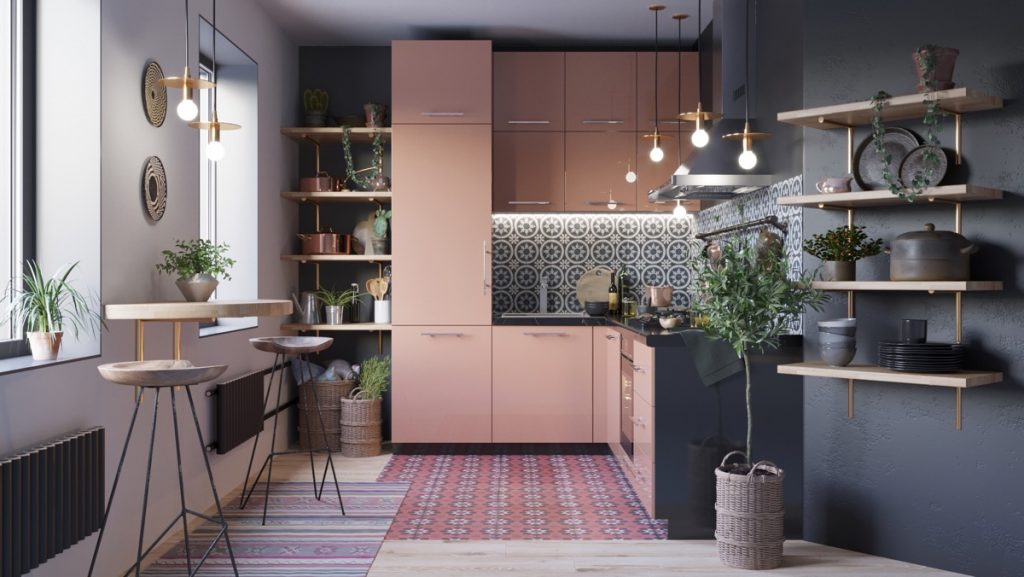
- Incorporating pastel-colored furniture into a modern living room for a chic, sophisticated look
- Adding pastel-colored accents to a neutral outfit for a pop of color that doesn’t overwhelm
Tips for Using Pastel Colors
While pastel colors can be beautiful, they can also be tricky to use effectively. Here are some tips for incorporating pastel hues into your designs:
- Pair pastel colors with neutrals to avoid a cloying, overly sweet look
- Use pastel colors sparingly to create a subtle, sophisticated effect
- Experiment with texture to add interest and depth to your pastel designs
- Consider the mood you want to convey – some pastels may be too soothing for a high-energy space
In Conclusion
Pastel color combinations can bring a touch of elegance, ease, and sophistication to any design project. Whether you want to create a serene oasis in your home or add a touch of whimsy to your branding, pastel hues are both versatile and timeless. With a little experimentation and attention to detail, you can create beautiful designs that showcase the modern elegance of pastel colors.